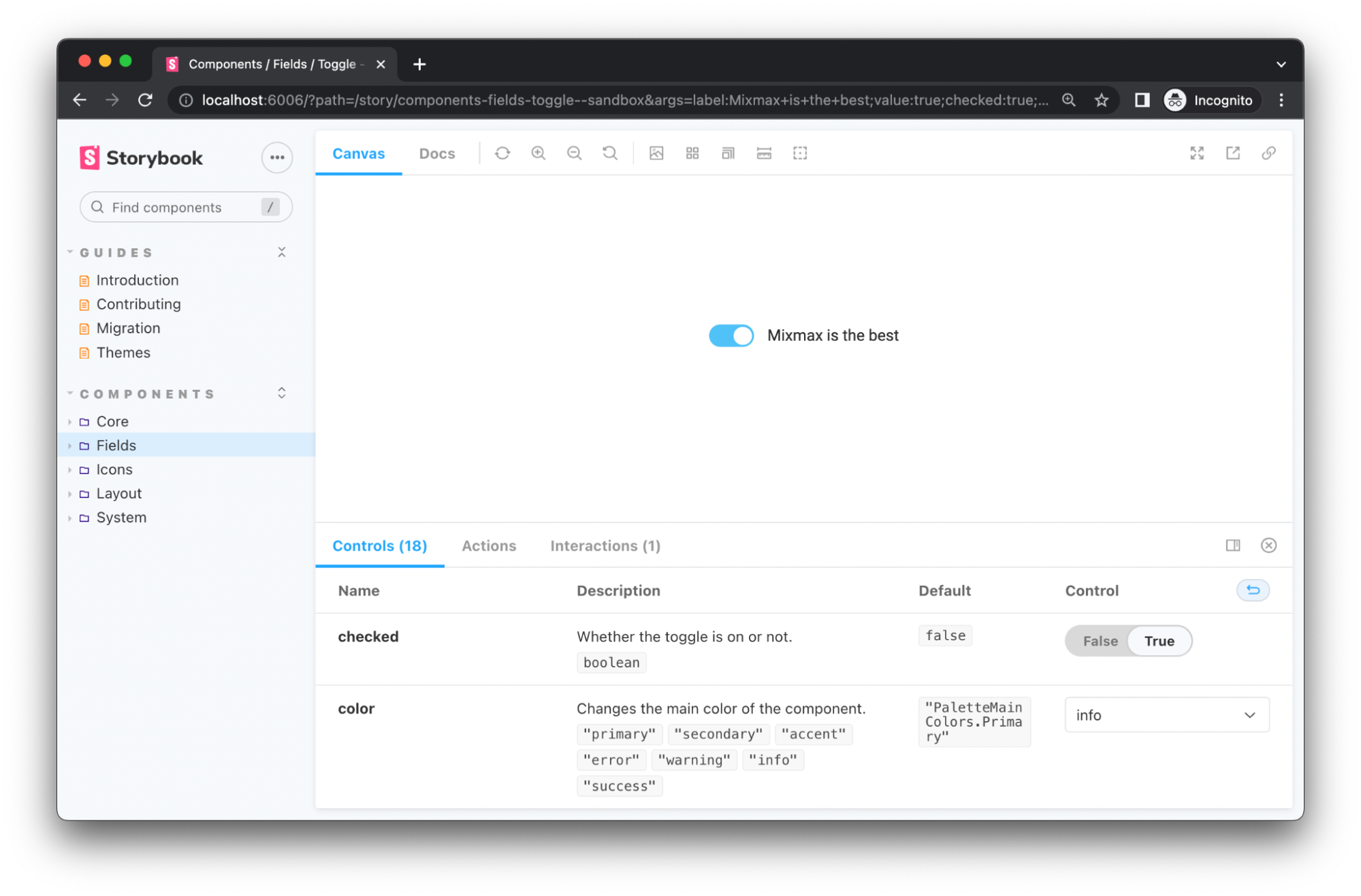
At Mixmax, we have multiple services and projects, including our dashboard, our extension, our website, and more. So, we need to have a centralized place where all our common frontend components will reside. That’s where the Mixmax Component Library comes in! (We usually call it CL for short.)
For frontend we mostly use React. And CL is used for providing small, reusable, and independent components for other services and more complex components. We consider this library a repository of Mixmax frontend “building blocks.” It’s similar to other libraries like MUI or Ant Design, but it’s also specifically “Mixmax-ish.”
Our latest standards are currently migrating from SASS to styled-components, and from JavaScript to TypeScript. During the process of working with both “styled” and TypeScript, we learned many tips and tricks on writing more maintainable code (that’s also enjoyable to write!). This article will be about some of them.
Transient Props
Styled-components usually pass props to underlying node and DOM elements. But that’s not always what we want to do. In fact, we most likely don’t want to pass our custom props down.
Let’s say I want to have a prop hasPadding for a component. Obviously, I don’t want to pass it down to the DOM.
That’s where transient props come in handy. Prefixing a prop with $ sign will prevent styled-components from passing these props down the tree. Here is a simple example:
```
const StyledBox = styled.div`
padding: ${({ $hasPadding }) => $hasPadding && '8px'};
`;
export function Box({ children, hasPadding }) {
return <StyledBox $hasPadding={hasPadding}>{children}</StyledBox>;
}
```
But, at the same time, we don’t want to have props prefixed for consumers. In this case, the prop is not prefixed for <Box />, but only for <StyledBox />.
There are many cases when we have a lot of props and we want to use them as transient. The question here is, What’s the best way to define types in this case? I’ll show you why this is the case. Let’s have a look at the same example, but in TypeScript and with more props. Types may look like this:
```
export interface BoxProps {
hasPadding?: boolean;
width?: string;
height?: string;
minWidth?: string;
minHeight?: string;
maxWidth?: string;
maxHeight?: string;
}
export interface StyledBoxProps {
// We need to define all of them???
$hasPadding?: BoxProps['hasPadding'];
$width?: BoxProps['width'];
$height?: BoxProps['height'];
$minWidth?: BoxProps['minWidth'];
$minHeight?: BoxProps['minHeight'];
$maxWidth?: BoxProps['maxWidth'];
$maxHeight?: BoxProps['maxHeight'];
}
```
In order to eliminate these repetitions, TypeScript mapping is extremely helpful! We defined the TransientProps type and used it to prefix each key of the provided type by $:
```
export type TransientProps<T> = {
// `keyof` returns also number and symbol types which we don't need
[K in Extract<keyof T, string> as `$${K}`]: T[K];
};
export interface BoxProps {
hasPadding?: boolean;
width?: string;
height?: string;
minWidth?: string;
minHeight?: string;
maxWidth?: string;
maxHeight?: string;
}
export interface StyledBoxProps extends TransientProps<BoxProps> {}
```
And that’s it! We can reuse it anywhere we want. Usually, we combine it with Pick and Omit like this:
```
type PropsWithoutPadding = TransientProps<Omit<BoxProps, 'padding'>>;
type WidthHeightProps = TransientProps<Pick<BoxProps, 'width' | 'height'>>;
```
Using `HTMLAttributes`
In order to keep all initial React attributes, don’t forget to extend HTMLAttributes types. That’s what we do—we have reusable base types for Spacing and Sizing, but we also use React base types:
```
export interface BoxProps extends SizingProps, HTMLAttributes<HTMLDivElement> {
// Custom props
}
```
Enum Usage
In many cases when we have a prop with limited values, we want to create enums. Here is an example:
```
enum BoxSizes {
Small = 'sm',
Medium = 'md',
Large = 'lg',
}
interface BoxProps {
size: BoxSizes;
}
function Box({ size }: BoxProps) {
// ...
}
function App() {
return <Box size={BoxSizes.Small} />;
}
```
But at the same time, there are cases when it would be nice to support string values, also. In such cases, we can convert an enum to a union like this:
```
interface BoxProps {
size: `${BoxSizes}`;
}
```
This will allow us to use both enums and strings:
```
function App() {
return (
<Fragment>
<Box size='md' />
<Box size={BoxSizes.Large} />
</Fragment>
);
}
```
Bonus Details
As a bonus, let me share with you which structure and naming conventions we chose for our Component Library.
First of all, we decided to separate components into modules, so that we don’t have them packed inside one folder. Currently, our structure is like this:
```
src/
core/
Button/
ButtonGroup/
Typography/
...
fields/
icons/
layout/
system/
index.ts
```
And then, in index.ts, we export all the needed components from these modules to make them accessible for consumer projects.
Secondly, we prefer to use named exports. In the past, we used default exporting, which led to name errors while importing (typos, like import Botton from ‘Button’). We also noticed that, in the end, we named these exports: export { default as Button } from ‘Button’. So, we decided to shift to named exports, which eventually feels much more convenient and pleasant.
And lastly, we have the following naming convention: the main file is called Component.tsx, while other ones are prefixed with the same name. And, we also have index.ts that exports needed objects and types. For example:
```
src/core/Button/
Button.stories.tsx
Button.styles.ts
Button.tsx
Button.types
Button.constants.ts
index.ts
```
And…
That’s it about a small part of our Component Library! I hope that these tips and tricks about managing styled-components within TypeScript were helpful.
Happy hacking!
Want to contribute to the Mixmax frontend? Visit Mixmax Careers.


