


At Mixmax, we're committed to delivering an exceptional UI/UX, and that drive for excellence has led us to make a significant shift—from traditional loading spinners to sleek skeleton placeholders in our frontend.
The Power of Skeleton Placeholders
Skeleton placeholders revolutionize the user experience by minimizing the perceived loading time. These placeholders serve as more than just eye candy; they effectively communicate the types of content being loaded, ultimately enhancing the perceived performance of our interface.
In this article, we'll delve into the React implementation of this game-changing component at Mixmax, sharing insights and a real-world use case from our codebase.
Crafting the Component with Style
In the Mixmax ecosystem, we leverage the power of `styled-components` to handle CSS in React. This robust tool not only elevates Developer Experience (DX) but also keeps our codebase cleaner. For a deep dive into tips and tricks, check out this article.
All our general reusable components find a home in our Component Library, where we craft them to be independent of external features and services. For simplicity, let's skip TypeScript types for now.
For versatility, we've designed the skeleton component to have different variants (block, rounded, circle, bubble, etc.) and the option to hide animation. First, let's create an optional shimmer animation:
const shimmerKeyframes = keyframes`
0% {
transform: translateX(-100%);
}
100% {
transform: translateX(100%);
}
`;
const shimmer = css`
&::after {
position: absolute;
top: 0;
right: 0;
bottom: 0;
left: 0;
background: linear-gradient(90deg, transparent, rgba(255, 255, 255, 0.75), transparent);
animation: ${shimmerKeyframes} 2s infinite;
content: '';
}
`;
Additionally, a helper function determines the correct borders based on the chosen variant:
function getBorderRadius(variant) {
switch (variant) {
case SkeletonVariants.Circle:
return '50%';
case SkeletonVariants.Bubble:
return '0 12px 12px 12px';
case SkeletonVariants.BubbleRight:
return '12px 0 12px 12px';
case SkeletonVariants.Rounded:
return '8px';
default:
return '0';
}
}
Finally, the styled component itself, with the added touch of using a helper function to fetch current theme colors:
export const StyledSkeleton = styled.div(
({ $hideAnimation, $variant, theme, ...props }) => {
const backgroundColor = getColor({
theme: theme,
color: PaletteCommonColors.Grey10,
});
return css`
position: relative;
overflow: hidden;
background-color: ${backgroundColor};
border-radius: ${getBorderRadius($variant)};
// Default height
height: 1em;
// Helper functions
${getSizing(props)}
${getMargin(props)}
${getFlexbox(props)}
${!$hideAnimation && shimmer}
`;
}
);
Once the styled component is ready, wrapping it with a React component is a breeze. Behold:
export function Skeleton({ variant, hideAnimation, ...fwdProps }) {
return <StyledSkeleton $variant={variant} $hideAnimation={hideAnimation} {...fwdProps} />;
}
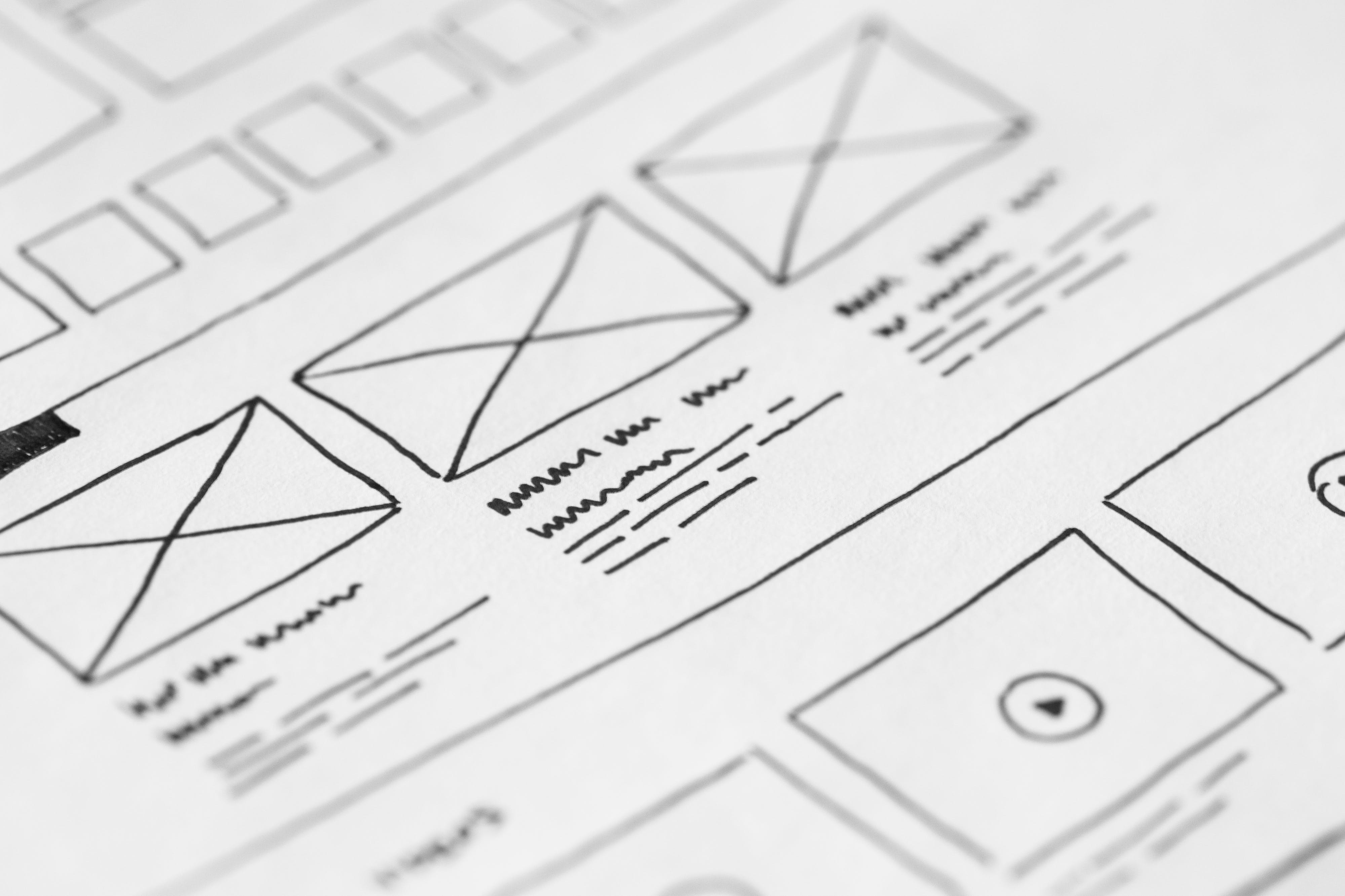
Then we set up a Sandbox story to experiment with the component and validate typical use-cases. Here's a snapshot of a few:

Example of Using the Component
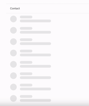
In action, we are implementing these skeleton placeholders for one of our tables, where we display a table of user contacts. While the contacts load, these placeholders provide a seamless transition.
Our state management relies on Redux at Mixmax. Here's a simplified snippet of our contacts table component:
export default function ContactsDashboardTable() {
const dispatch = useDispatch();
const contacts = useSelector(selectContacts);
const isLoadingContacts = useSelector(selectIsLoadingContacts);
function handleItemClick({ id }) { /* ... */ }
useEffect(
function fetchInitialData() {
dispatch(loadContacts());
},
[dispatch]
);
return (
<ListTable
headers={[{ id: 'contact', label: 'Contact' }]}
items={isLoadingContacts ? getSkeletonItems() : getRenderedItems(contacts)}
onItemClick={isLoadingContacts ? undefined : handleItemClick}
/>
);
}
When fetching contacts, the `getSkeletonItems` function kicks in, populating 8 rows of skeleton placeholders for the contact column:
export function getSkeletonItems() {
return Array.from({ length: 8 }, (_, index) => ({
id: index.toString(),
contact: (
<Flex container flexDirection='row' gap={2}>
<Skeleton variant='circle' height='34px' />
<Flex container gap={0.75}>
<Skeleton variant='rounded' height='14px' width='64px' />
<Skeleton variant='rounded' height='14px' width='160px' />
</Flex>
</Flex>
),
// ...
}));
}
And now, the moment you've been waiting for — the final result:
In Conclusion
That's a wrap! Implementing skeleton placeholders has proven to be a game-changer, significantly enhancing UI/UX in modern web applications. Happy coding!
Ready to contribute to the Mixmax frontend? Explore opportunities at Mixmax Careers.