


You know how it goes. You spend ages crafting the perfect cold email—you nail the subject line, the opening, and the value prop. Then you get to the end and tack on a generic, "Are you free to chat?" And then… crickets. That final sentence is where so many great emails go to die. A powerful call to action email doesn't just ask for a meeting; it starts a conversation. Your cold email CTA is the single instruction guiding your prospect to the next step. If it’s weak or confusing, you’ve lost them.
And one of the most important pieces of all…
The call to action (CTA).
The cold email call to action is what’s going to make or break your email.
Without it, your prospect will have no idea what you’re expecting from them.

And with a crappy one, you risk either confusing them, annoying them, or both. And we’ve all written crappy ones at some point (don’t lie!).
You’ll find examples of those below.
The only option you’ve got left is to come up with a call to action that will entice your prospect to:
- Not immediately trash your email
- Not roll their eyes at your predictable CTA
- Consider replying
- Hit Reply
- Write out an answer
- Hit Send
And you know as well as we do that more often than not, options 1+2 are the default choices.
But with a little bit of help (and by “a little bit,” we mean a fudge ton) from our own sales team + top sales experts on LinkedIn, we’ve put together a list of cold email call to action examples that actually get responses.
Here’s what you’ll find in this blog:
|
Your Quick Guide to Email CTAs
This guide is going to help you craft non-boring sales email CTAs. We share quick and dirty tips for effective CTAs, highlight the ones you should avoid, and provide a bunch of examples from our own sales team + LinkedIn sales experts that actually get responses.
We've got you covered with super short CTAs, conversation starters, social proof, educational, competitor-focused, hypothesis verification, and even some funny and GIF-based CTAs.
At the end, we also share how you can use super cool email enhancements (for Gmail) to up your chances of landing that reply.
Define Your Goal: What Do You Want Them to Do?
Before you even think about what to write, you need to know your endgame. What is the one single thing you want your prospect to do after reading your email? Your call to action isn't just a nice-to-have sentence at the end; it's the entire point of your outreach. It’s the instruction that guides your prospect toward the next step. As the team at Expandi puts it, "A Call to Action (CTA) is a short, simple phrase at the end of your email. It tells the person what you want them to do next to move things forward, like getting on a call or replying." Without a clear, compelling CTA, your email is just information. With one, it’s a conversation starter.
Match the CTA to the Buyer's Journey
Your CTA needs to meet your prospect where they are. A generic "Book a demo" might work for someone who's already familiar with your brand, but for a cold lead, it can feel like a huge leap. It's crucial to align your ask with their stage in the buying process. According to Klaviyo, "Modern CTAs should match what the customer is thinking and where they are in their journey with your brand." Think about it: if they've never heard of you, a low-friction ask like "Is this a priority for you right now?" is much more likely to get a response than a request for 30 minutes of their time. Always consider their perspective and make the next step feel easy and logical.
Think Beyond the Sale
While booking a meeting is often the ultimate prize, your CTA can serve other important purposes, especially early on. The goal is to start a dialogue and build trust, not just secure a calendar invite. Sometimes, the best move is to offer value without asking for anything significant in return. As Klaviyo points out, "CTAs can also encourage people to learn about your brand, read content, or get customer service help." You could ask for their opinion on a recent industry report, point them to a blog post you wrote that solves a common pain point, or simply ask a question that makes them think. These softer CTAs build rapport and position you as a helpful resource, not just another salesperson.
Quick Tips for a Better Cold Email Call to Action
When we say quick & dirty, we mean it. Here are four tips to always keep in mind before crafting your sales email call to action.
- Do not use more than 1 CTA: It’s hard enough getting an answer to one question; best not to confuse your prospect further.
- Use close-ended questions: It’s easier to answer a “yes” or “no” question than to have to answer “How,” “What,” and “Why” questions. Leave the open-ended questions for AEs.
- Interest-based CTAs perform better: According to Gong, interest-based CTAs perform better than asking for a meeting. Numbers don’t lie. Take the advice.
- Include a calendar link in your signature: A cold email CTA’s goal should be to start a conversation, not to push a meeting. But if you want to give your prospect the option to book a meeting right away, just put a link in your signature instead. Low-friction. Easy-peasy.
Watch the full webinar recording with Jason Bay and Jack Wauson
on cold email tactics that boost reply rates.
Stick to One Primary CTA
It’s tempting to give your prospect options. Maybe they’d like to book a meeting, or perhaps they’d prefer to check out a case study, or maybe they want to visit your website? Stop right there. Giving someone too many choices often leads to decision paralysis, where they end up choosing nothing at all. Your cold email should have one clear, singular goal. This focus makes it incredibly easy for the reader to understand what you want them to do next. By presenting a single, compelling call to action, you remove any confusion and guide them toward the one step that matters most for moving the conversation forward.
How to Write a Call to Action That Gets Clicks
Once you’ve committed to a single CTA, the next step is to write one that people actually want to click. The words you choose can make the difference between an email that gets a reply and one that gets archived. It’s not just about telling them what to do; it’s about making them feel like it’s the right thing to do for them. A great CTA is clear, concise, and value-driven. It should feel less like a command and more like a helpful suggestion that benefits the reader. Let’s break down a few simple but powerful techniques to make your CTA copy more effective.
Focus on Value, Not Just Action
Your call to action should always answer the prospect’s silent question: “What’s in it for me?” Instead of focusing on what you want them to do, frame the CTA around the benefit they will receive. For example, instead of saying “Download our guide,” try something like “Get my free sales template.” The second option highlights the value they’ll get, not the action they have to take. This simple shift in perspective makes your request feel less like a chore and more like an opportunity. Always try to use the word "you" or "my" to make it about them, not you.
Keep Your CTA Short and Punchy
No one has time to read a long, complicated call to action. Your CTA should be brief and to the point, ideally four or five words at most. If it takes more than a few seconds to understand, you’ve already lost your reader’s attention. Think of it as a quick, clear instruction. Use strong action verbs that create a sense of momentum. Phrases like “Book a demo,” “Learn more,” or “Get started” are effective because they are direct and easy to process. The goal is to make the next step so obvious and effortless that they don’t have to think twice about it.
Use Urgent Language (When Appropriate)
Creating a sense of urgency can encourage people to act immediately rather than putting it off for later. Words like “now,” “today,” or phrases that imply limited availability can be very effective. For example, “Grab your spot now” feels more pressing than just “Register for the webinar.” However, this tactic should be used authentically. Don’t create false scarcity, as it can damage your credibility. Use it when there’s a genuine reason for the urgency, like a limited-time offer or a few remaining seats for an event. When used correctly, it can give your prospect the nudge they need to take action.
Avoid Words That Imply Work
Certain words can subconsciously make your request feel like a burden. Words like “submit,” “download,” “buy,” or “sign up” can imply that the prospect has to do work or make a commitment they aren’t ready for. Instead, try using softer, more inviting language. For instance, swap “Buy now” with “Get your copy” or “Submit your form” with “Send my info.” These small changes in wording can make the action feel less demanding and more appealing. The key is to choose verbs that encourage action without sounding like you’re adding another task to their to-do list.
Write in the First Person
Here’s a simple trick that can have a huge impact: frame your CTA from the reader’s perspective. Using words like “my” instead of “your” can make the action feel more personal and empowering. For example, changing a button from “Start your free trial” to “Start my free trial” has been shown to significantly increase clicks. This works because it puts the reader in the driver’s seat. They are claiming the offer for themselves, which feels more proactive than simply responding to a command. It’s a subtle psychological shift that makes the CTA more about their choice and their benefit.
Designing Your Call to Action Button
If you’re sending marketing emails or using HTML templates in your sales sequences, the visual design of your CTA is just as important as the text. A well-designed button can draw the eye and make it obvious what the next step is. People are naturally drawn to visually distinct elements, and a button stands out far more than a simple text link. The color, size, and placement all play a role in whether your CTA gets noticed and clicked. Think of your CTA button as a visual signpost that guides your reader exactly where you want them to go.
Choose a Button Over a Link
Whenever possible, use a clickable button for your main call to action instead of a hyperlink. Buttons are designed to be clicked. Their shape, color, and surrounding space make them stand out in a sea of text. In fact, studies have shown that using a CTA button instead of a text link can increase click-through rates by up to 28%. A button is a clear visual cue that tells the reader, “Click here to do the thing.” It’s an unmistakable signal that removes any guesswork and makes the desired action feel intuitive and easy.
Use Color to Influence Action
Color is a powerful tool in design, and the color of your CTA button can have a real impact on whether people click it. Choose a color that contrasts with the background of your email to make the button pop. While there’s no single “best” color for conversions, bright colors like orange, green, or blue often perform well because they grab attention. It’s also a good idea to stay consistent with your brand’s color palette. The most important thing is that the button is highly visible and looks clickable. Don’t be afraid to test different colors to see what resonates most with your audience.
Give Your CTA Some Breathing Room
Don’t crowd your call to action. Surrounding your CTA button with plenty of white space is a simple but effective design trick. This negative space acts as a buffer, separating the button from other elements in your email and drawing the reader’s eye directly to it. When a button is crammed between blocks of text or images, it can get lost in the clutter. By giving it some room to breathe, you increase its visual prominence and make it look more important. This makes it easier for your reader to spot and ultimately makes them more likely to click.
Make Sure It's Accessible
Your CTA needs to be easy for everyone to see and read, including people with visual impairments. This is where accessibility comes in. A key principle is to ensure there is sufficient color contrast between your button text and the button’s background color. The recommended standard is a contrast ratio of at least 4.5:1 for normal text. Using a color contrast checker online is an easy way to test your design. Making your CTAs accessible is not only the right thing to do, but it also ensures that your message can reach the widest possible audience without any barriers.
Where to Place Your CTA (and How to Test It)
You’ve written compelling copy and designed a beautiful button, but where should you actually put it? The placement of your CTA can dramatically affect its performance. You also can’t assume that what works for one audience will work for another. That’s why testing is so critical. By strategically placing your CTA and continuously testing different variations, you can gather data-driven insights to refine your approach. This ensures you’re not just guessing but are actively optimizing your emails for the best possible results.
Put Your Main CTA "Above the Fold"
"Above the fold" is a term from the newspaper era, and in email, it refers to the part of the message that’s visible without scrolling. Your most important information, including your primary call to action, should always be placed here. Most people scan emails quickly, so you have a very short window to capture their interest. By placing your CTA in this prime real estate, you ensure that everyone who opens your email will see it immediately. This gives you the best chance of getting a click, even from readers who only skim the content.
A/B Test Everything
Never assume you know what will work best. The only way to be sure is to test it. A/B testing involves creating two versions of your email with one small difference—like the CTA button color, the text, or its placement—and sending each version to a segment of your audience. By tracking which version gets more clicks, you can learn what resonates with your prospects. You can test anything from a simple word change to a completely different offer. Consistently testing your CTAs will help you refine your strategy over time and lead to better engagement and more replies.
Align Your CTA with Your Landing Page
When someone clicks your CTA, the journey isn’t over. The landing page they arrive on must be a seamless continuation of the email. This means the headline, offer, and overall message should directly match the promise you made in your call to action. If your CTA says “Get my free template,” the landing page should immediately present that template, not a generic homepage. A disconnect between your email and landing page can be jarring and will cause people to leave. Using AI-powered workflows can help ensure this entire customer journey is cohesive and delivers a consistent experience from start to finish.
The Worst Cold Email CTAs We've Ever Seenavoid using (our team has seriously received ALL of these)
These are cold email CTA examples that you should stop using ASAP. They may have worked 10 years ago, but not anymore.
- Are you free on [date] at [time] for a quick chat?
- Do you have time to chat about this tomorrow?
- Please book a meeting with me here.
- What are some of the initiatives your team is working on in Q3?
- (You should figure this out on your own)
- How about you book some time with me next week?
- How about you shoot me a quick reply?
- Did you receive my previous 3 emails???
- Are you the wrong person to reach out to?
- Can you tell me who the right person to reach out to is?
- What makes sense as a next step?
- Do you have any questions?
- Thoughts?
Try These Cold Email Call to Action Examples for More Replies
The "Less is More" CTA
- Worth a chat?
- Open to checking it out?
- Think this could help?
- Curious to see how?
- Worth discussing?
- Opposed to learning more?
Start a Conversation
- Is [goal] a priority right now?
- Are you happy with your team’s [specific output]?
- Is this something that’s on your radar as well?
- Have you tried this approach before?
- Curious if you’re seeing that? (borrowed from Will Allred)
- Do you think this would make your life easier?
- [Main pain point] sucks. Do you want it to suck less?
- Would you say this aligns with your [year] initiatives?
- Would it help if your team could [outcome]?
- Have you considered this? (borrowed from Josh Braun)
- Even remotely interested?
- Open to seeing how it works? (borrowed from Armand Farrokh)
Use Social Proof to Build Trust
- Want to see how other companies who wanted [similar goal] were able to achieve it?
- There’s a case study link below my email signature. If you want to learn what [company] would do differently knowing what they know now, let me know. (borrowed from Leslie Venetz)
Offer Something of Value
- Mind if I send you a 1-min video on how we do that? (borrowed from Florin Tatulea)
- The [relevant topic] annual report was just published. Would it be helpful to share a copy with you? (borrowed from Leslie Venetz)
- Since [personalized topic] seems important to you, do you want to attend a webinar on [Title]? Let me know and I’ll send an invite.
- Would you be interested in our latest white paper on [personalized topic]?
| Related post: Outbound SDR Tips from Your Fave Sales Influencers |
Competitor CTAs
- Are you using [Competitor 1] or [Competitor 2]?
- Have you ever used a [your type of product/service]?
- Have you been able to achieve [goal] with [Competitor]?
- Open to reviewing another option?
Ask to Verify an Assumption
- Am I completely off with this?
- Am I wrong in thinking [goal] is your main focus right now?
- Is this resonating with you or am I just rambling here?
Ask for an Introduction
- Should I loop in [Person’s name] too?
- Do you think [Person’s name] would also be interested in this?
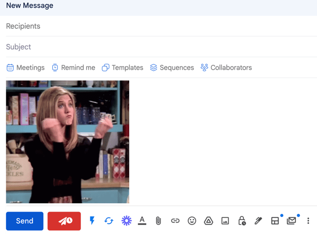
Show Your Funny Side (Carefully!)
- Are you remotely interested to learn more or should I www.zipit.com? 🤐
- Open to discussing more or should I just vanish like a magician’s assistant?
- If you’re down to learn more, reply “Aye Aye Cap’n”
The "14-Minute Meeting" CTA
Here’s a clever one to try in your next sequence: the "14-Minute Meeting." This approach is brilliant because it taps into a simple psychological principle—a specific, slightly unusual time commitment feels way less demanding than a generic "30-minute chat." For a busy professional, agreeing to 14 minutes is an easy yes. It feels calculated and intentional, as if you know exactly how much time you need and won't waste a second of theirs. It also gives them an out; if they’re too swamped, it’s a small enough task to delegate to someone else on their team, which still gets your foot in the door.
And it's not just a hunch. Sales experts agree that using slightly random, smaller numbers makes the time commitment feel less daunting. Suggesting a 14 or 22-minute call lowers the perceived effort and friction of scheduling, which is often the biggest hurdle. This small tweak can make a huge difference in your reply rates because you’re showing respect for their time while making it incredibly simple for them to engage. It’s a low-risk, high-reward move that helps you stand out from the sea of vague "let's connect" requests flooding their inbox every single day.
Of course, a clever CTA can't save a weak email. As others have pointed out, a good call to action needs the rest of your email to be strong, too. Your subject line, personalization, and value prop all have to work together to earn that reply. This is where having a solid process comes in. For instance, using AI-powered workflows can handle the tedious parts of outreach, giving you more time and mental energy to focus on crafting a compelling message that makes your clever CTA impossible to ignore. It’s all about working smarter, not harder.
How to Improve Reply Rates with Email Enhancements
Here's the truth about email replies: It's not that prospects don't want to reply, they just don't want to have to write an email to respond.
So instead of expecting them to write out an email, give them options that make replying easy.
Mixmax has some crazy cool enhancements (semi-boasting) you can add directly to your emails that require the recipient to click one button to reply. No hitting Reply, no writing, no hitting Send.
Sorcery? Nah.
Check them out below.

Add One-Click Polls
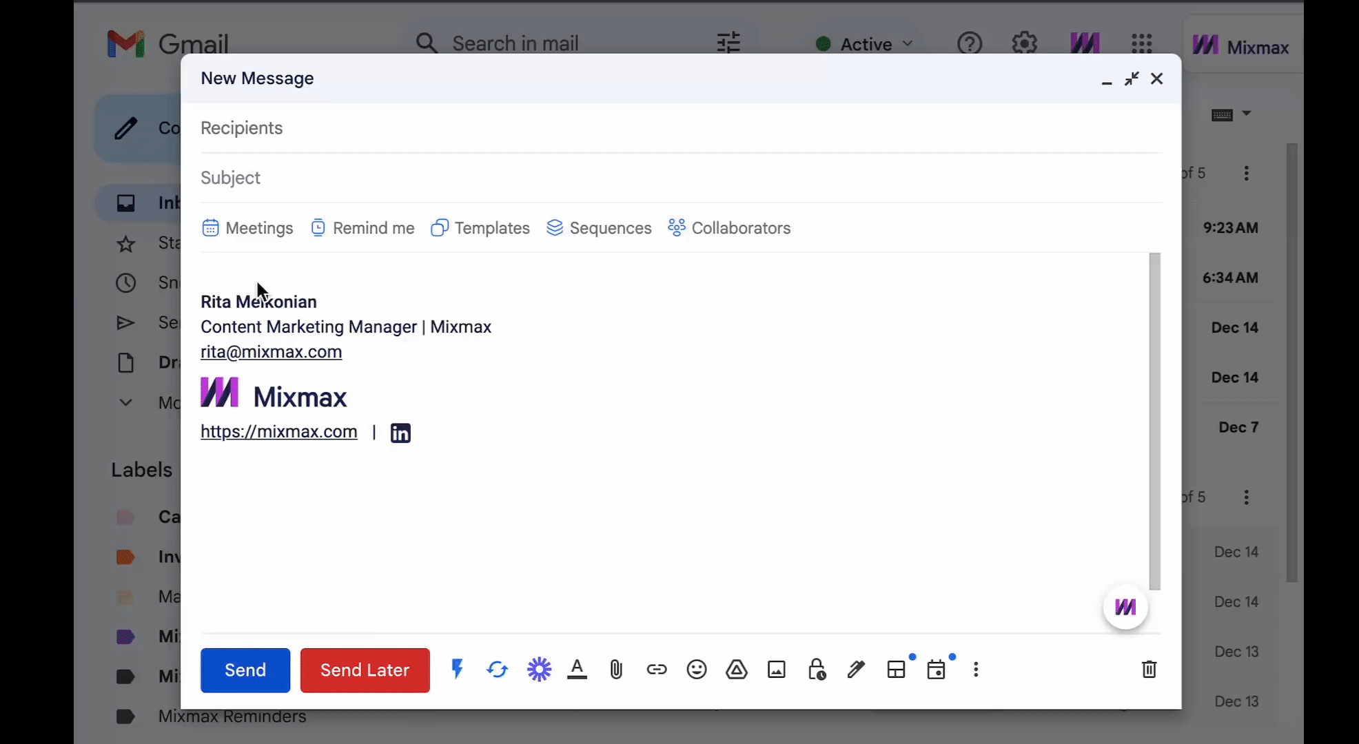
Mixmax's Polls feature
Try One-Click Surveys
Schedule with One-Click Meetings
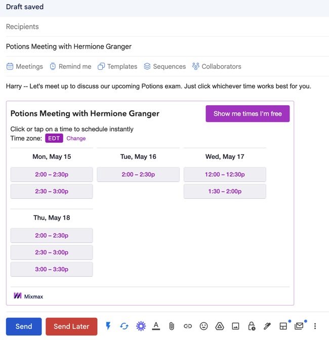
| Fun fact: SDRs book 57% more meetings when they share their availability directly in email. |
Bonus email enhancements:
Generate Link Previews
Embed a GIF
^^ IYKYK
Your Next Steps for Better Email CTAs
And there you have it! We've explored the vast world of cold email calls to action, sharing some kickass insights and examples to help you get those much-desired responses.
The secret lies in asking for interest over asking for meetings, starting conversations, keeping it simple, offering value, and making it easy for your prospects to engage with you.
Boom. Happy prospecting!
Frequently Asked Questions
What's the biggest mistake people make with their cold email CTAs? The most common mistake is asking for too much, too soon. Going straight for a 30-minute meeting in a first-touch email is like asking someone to marry you on a first date. It’s a huge commitment for someone who doesn’t know you or your company yet. Your initial goal should be to make replying feel as easy as possible, not to add a task to their already packed calendar.
Should I ask for a meeting or just try to start a conversation? Always aim to start a conversation first. A simple, interest-based question like, "Is this a priority for you right now?" is much easier for a busy person to answer than a request to check their calendar. This low-friction approach gets the dialogue started. You can always include a scheduling link in your email signature for prospects who are ready to book, but your direct call to action should focus on getting that initial reply.
With so many examples, how do I pick the best CTA for my email? The right CTA depends entirely on your email's goal and your prospect's context. Think about the main point of your message. If you're highlighting a specific pain point, ask if they're experiencing it. If you're offering a valuable resource, ask if they'd like you to send it over. The best CTA feels like a natural next step to the information you've just provided, not a random request tacked on at the end.
My emails are just plain text. Do I still need to think about design? Absolutely. While you won't be using colored buttons, the principles of good design, like clarity and emphasis, still matter. "White space" is your best friend. Don't bury your call to action at the end of a dense paragraph. Instead, give it its own line so it stands out. The goal is to make your question impossible to miss as your prospect skims the email.
What if my CTA is great but I'm still not getting replies? A perfect call to action can't save an email that misses the mark. Your CTA is the final piece of a much larger puzzle. If your subject line doesn't get the email opened, or if your opening line and value proposition aren't compelling, your prospect will never even get to your brilliant question. Make sure the entire email is personalized, relevant, and focused on the prospect's world before you start tweaking the final sentence.
Key Takeaways
- Prioritize interest over meetings: Your initial goal is to start a conversation, not to secure a calendar slot. Use simple, close-ended questions to gauge their interest, as this requires less commitment and is easier for a busy prospect to answer.
- Focus on a single, clear call to action: Don't confuse your reader by offering multiple choices. A single, direct CTA eliminates decision paralysis and clearly guides your prospect on what to do next, making your email more effective.
- Make it easy to respond: Prospects are more likely to engage when the next step is effortless. Instead of asking them to type a reply, use interactive elements like one-click polls or provide a direct scheduling link in your signature to reduce friction.